The Brief
Create a group of three posters to advertise a guest speaker. Since the guest speaker is a typographer, use only type to create an engaging final product. Each poster should emphasize a different informative element. One poster for the event, one poster for the speaker, and one for the quote. Be sure to pay close attention to hierarchy.
The Goal
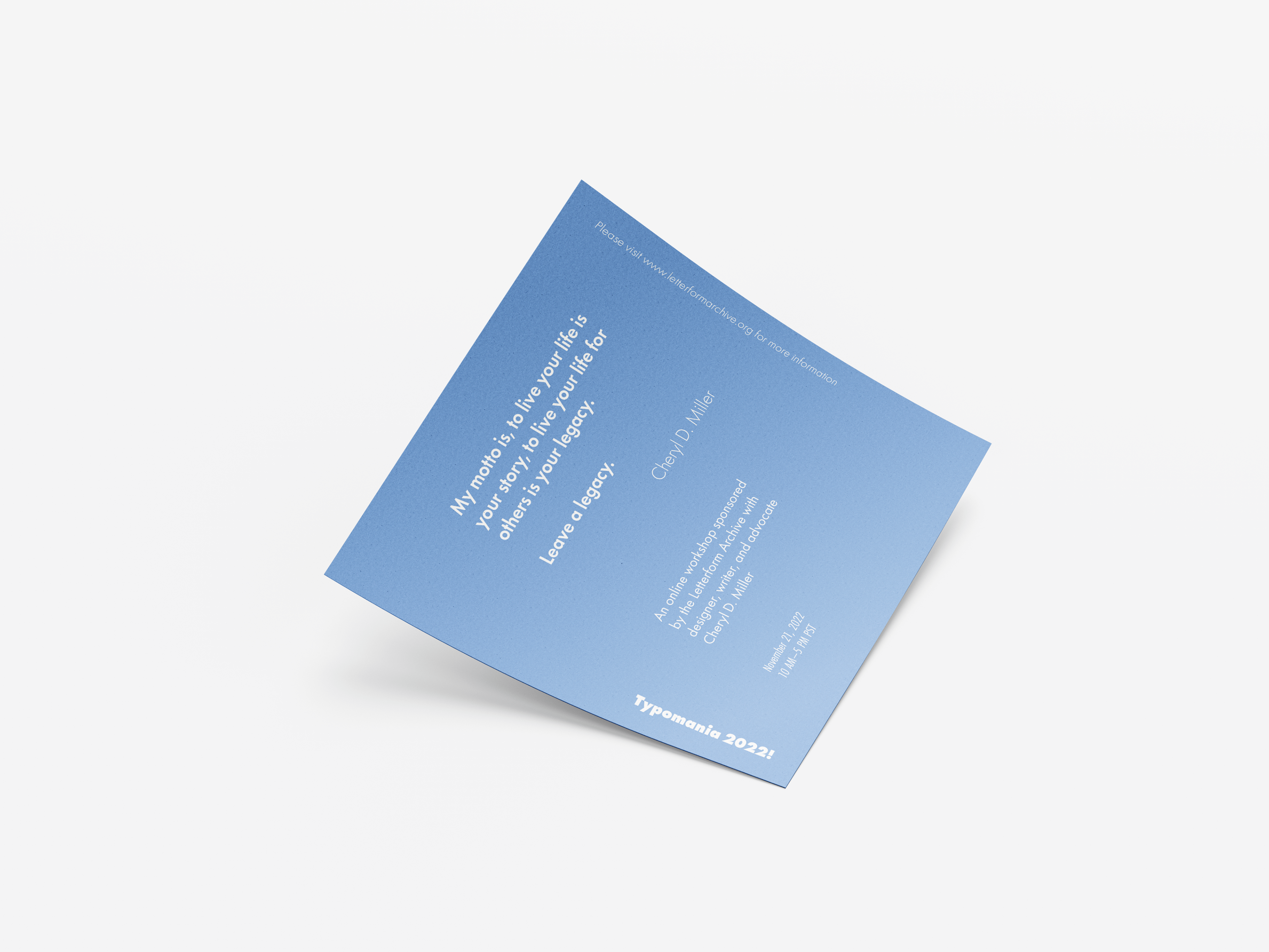
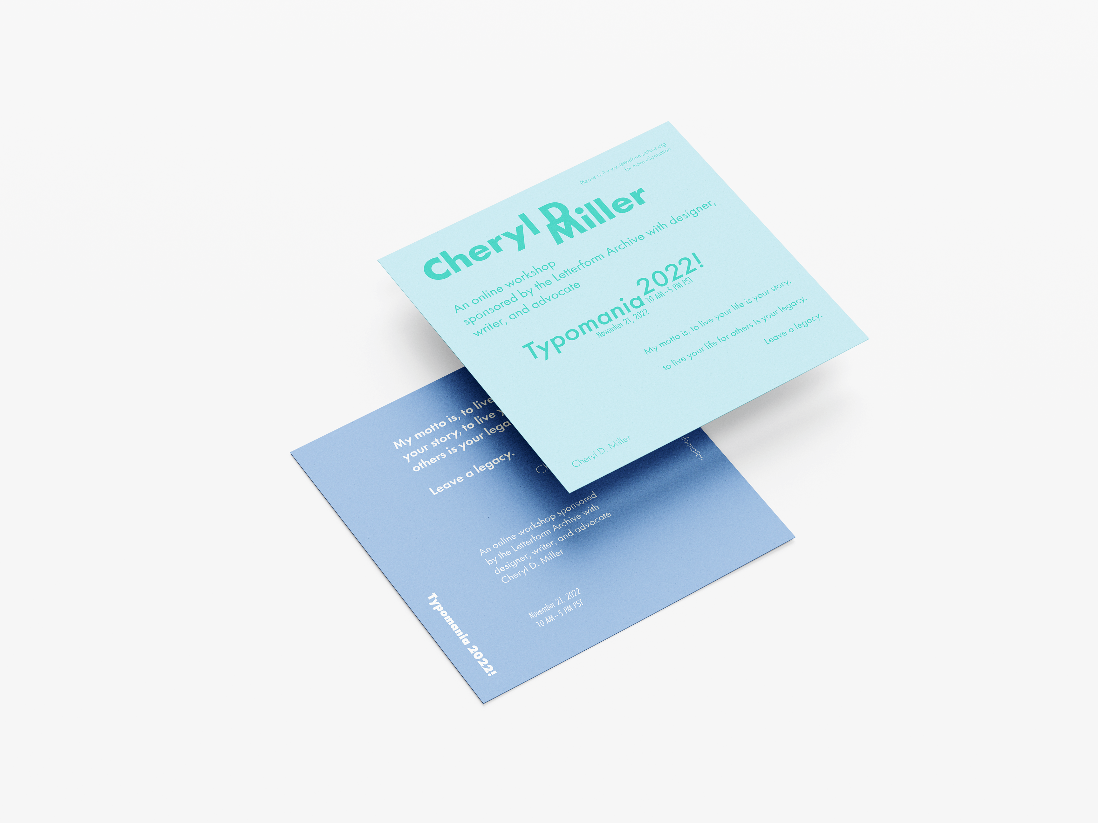
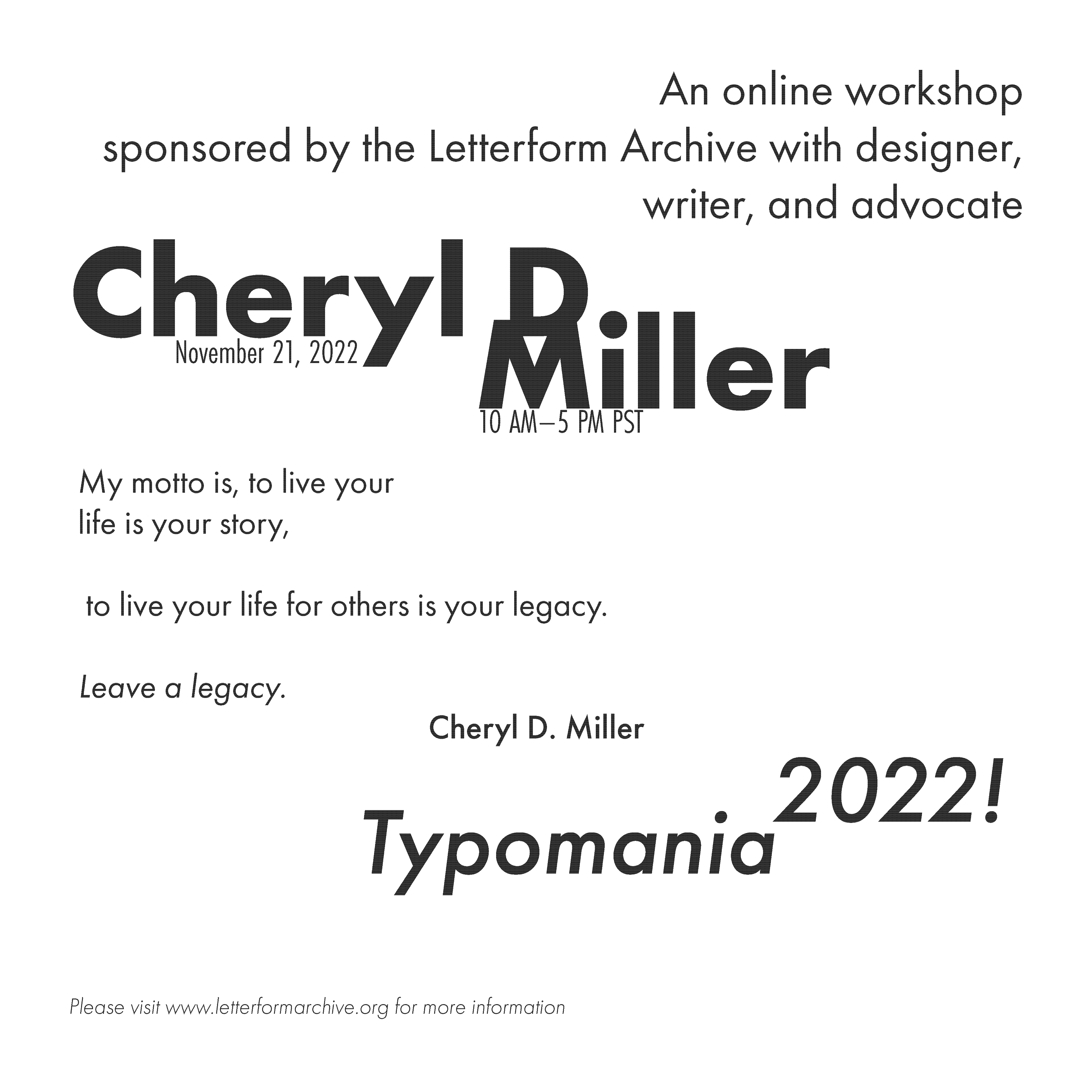
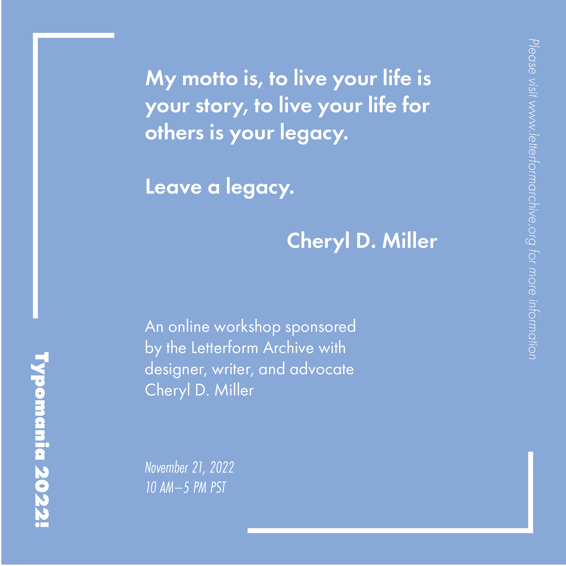
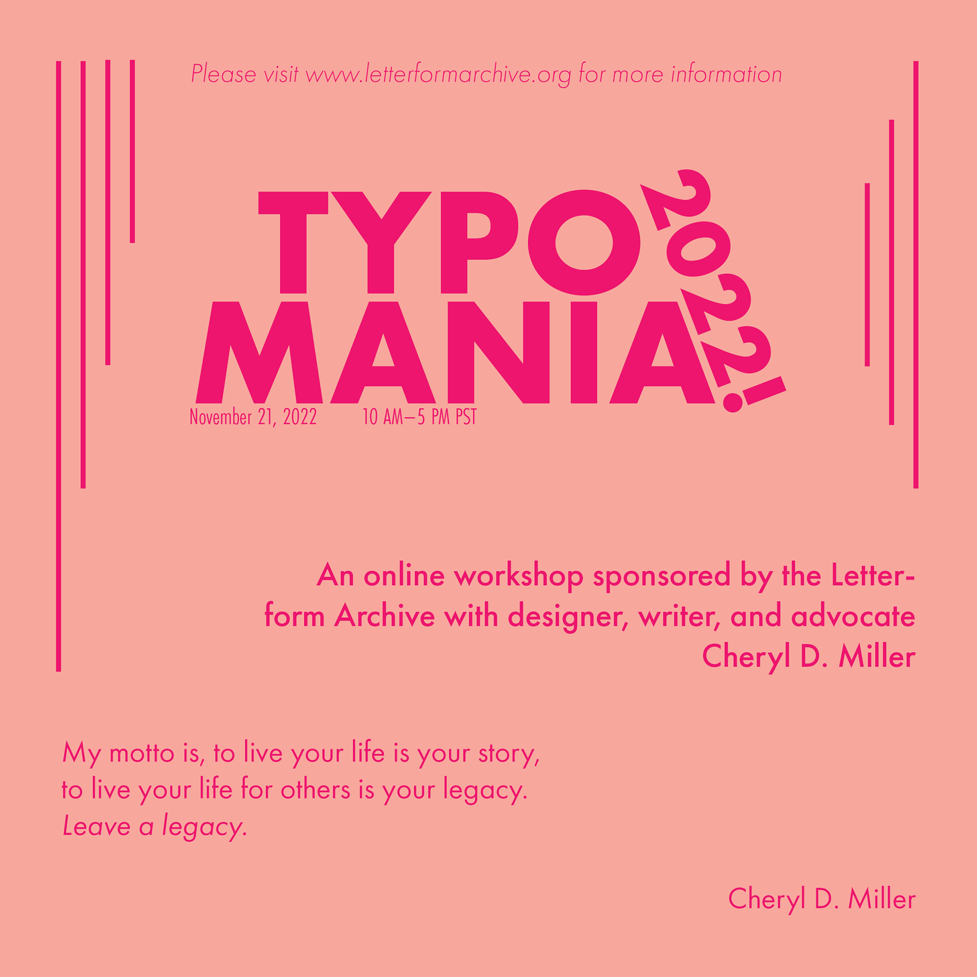
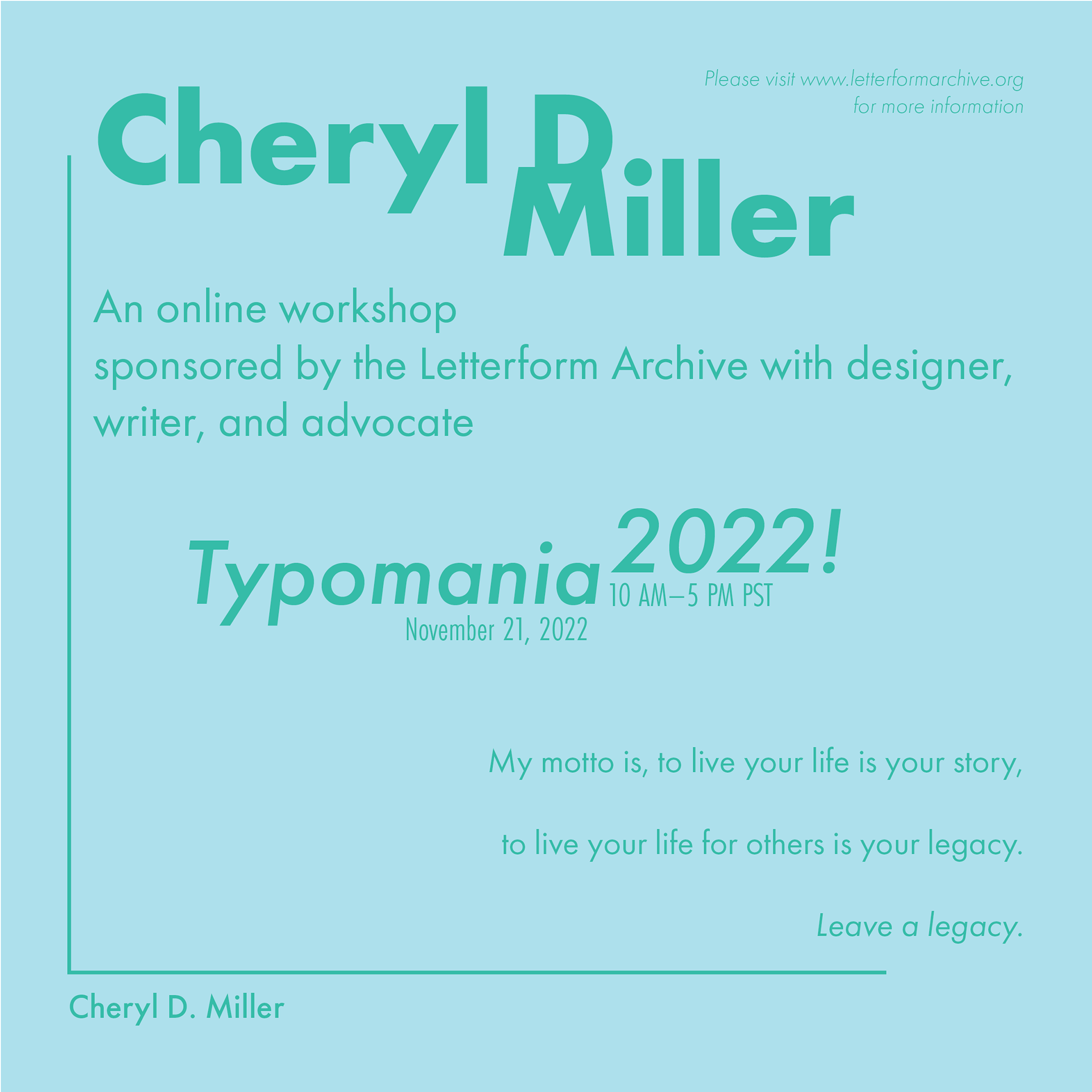
Knowing I would have to create this poster using only type, I went into this project with multiple goals. The first was to use type to fill the provided space effectively while maintaining legibility. The second was to maintain a distinct hierarchy of information. The third was to ensure the poster was noticeable and engaging even from a distance. The final goal was for all three posters to have an obvious visual relationship to one another.
Brainstorming
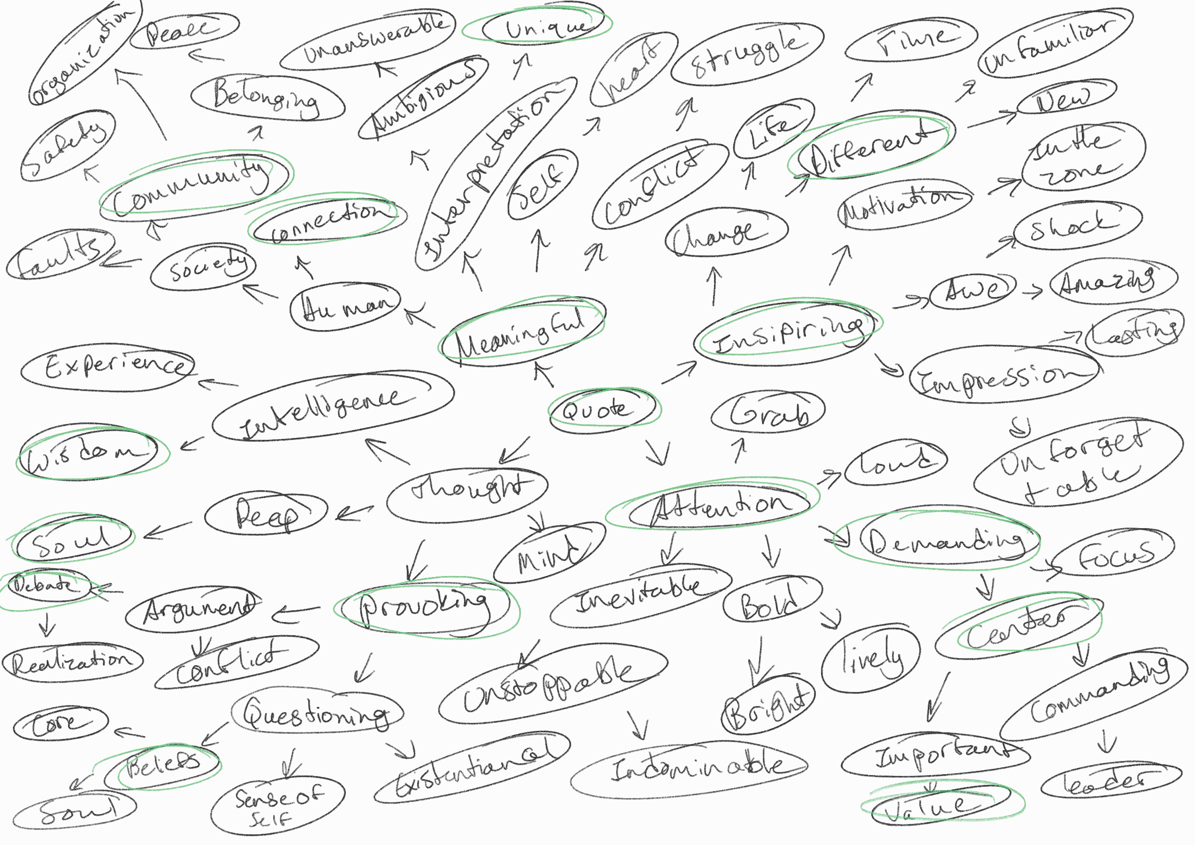
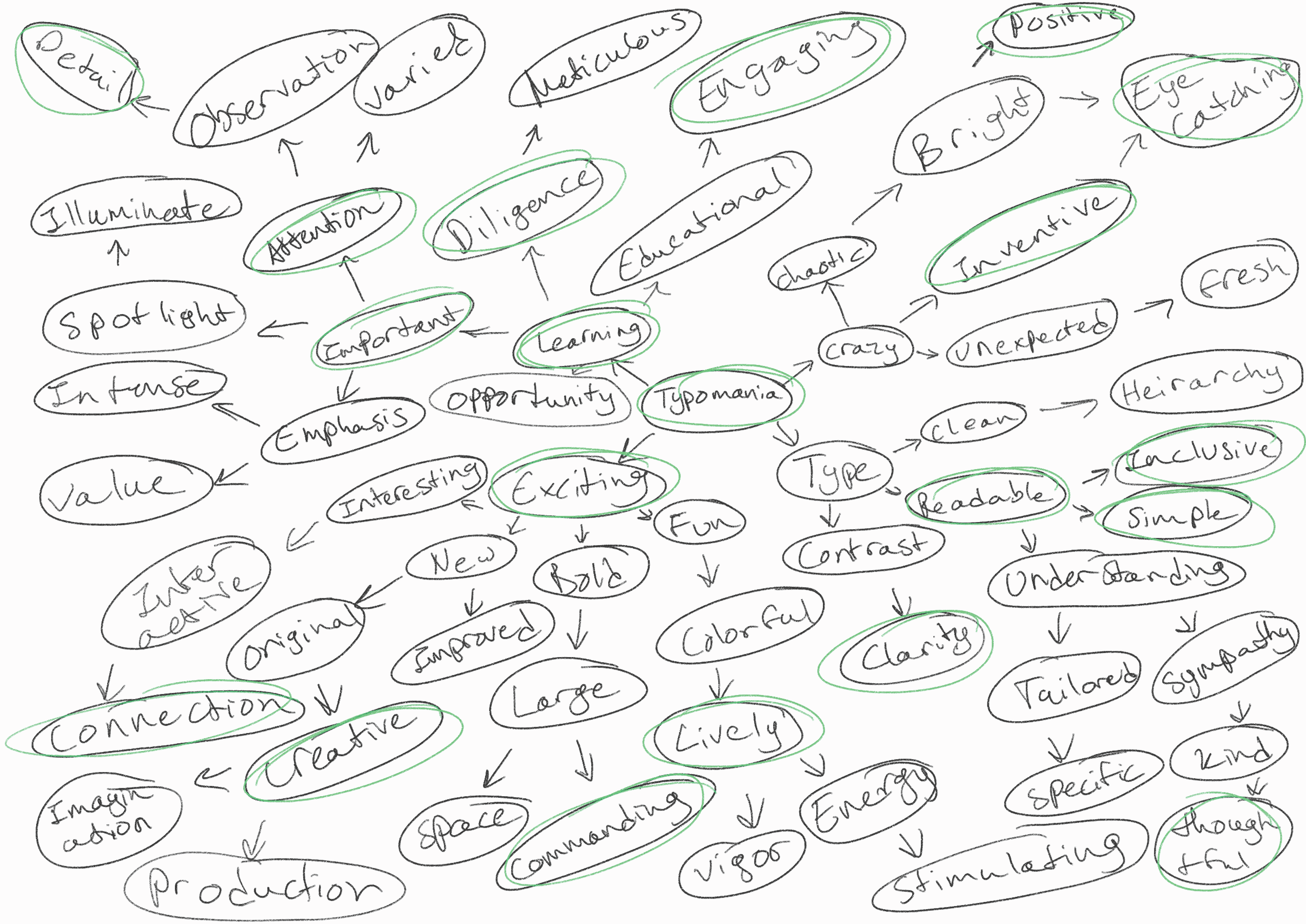
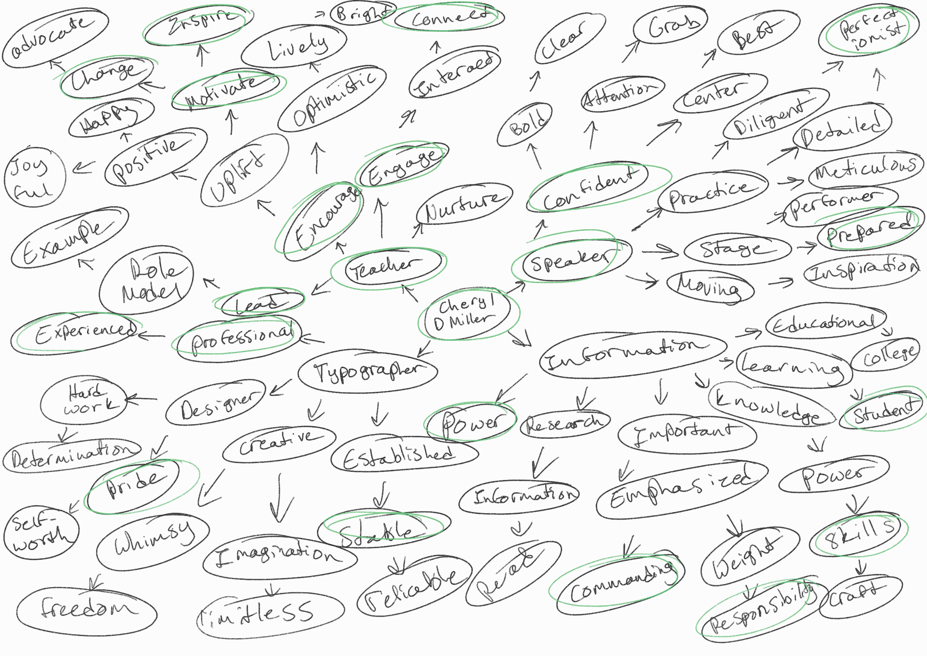
Keeping my goals in mind, I started brainstorming sessions with a mind map to help sort out my ideas. I placed the focus of each poster at the center of the map and worked outwards from there. After I finished, I circled out concepts that resonated with me and took that forward into the ideating stage.
Visual Research
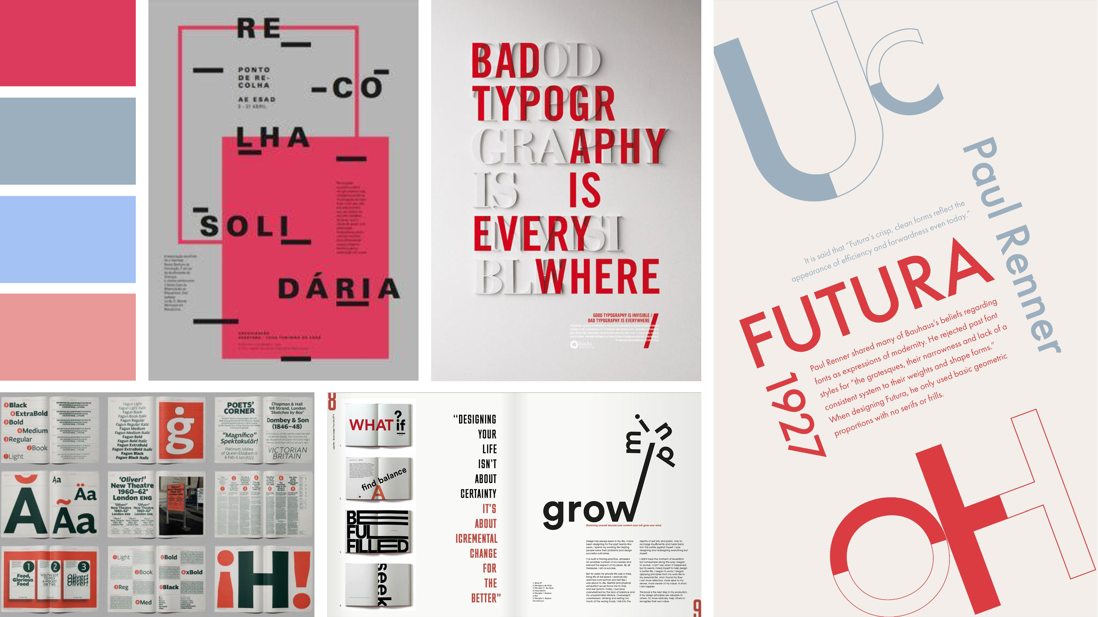
I spent a fair bit of time analyzing other type-only posters to see how other designers utilized the space given without the aid of any other visuals. The recurring pattern I noticed was the use of type in place of the normal illustrative visuals you would often find on posters. I also tried to determine colors that would easily pop and contrast with each other on a poster. I saw frequent use of brighter reds and blues on darker more subdued backgrounds to heighten contrast.
Ideation
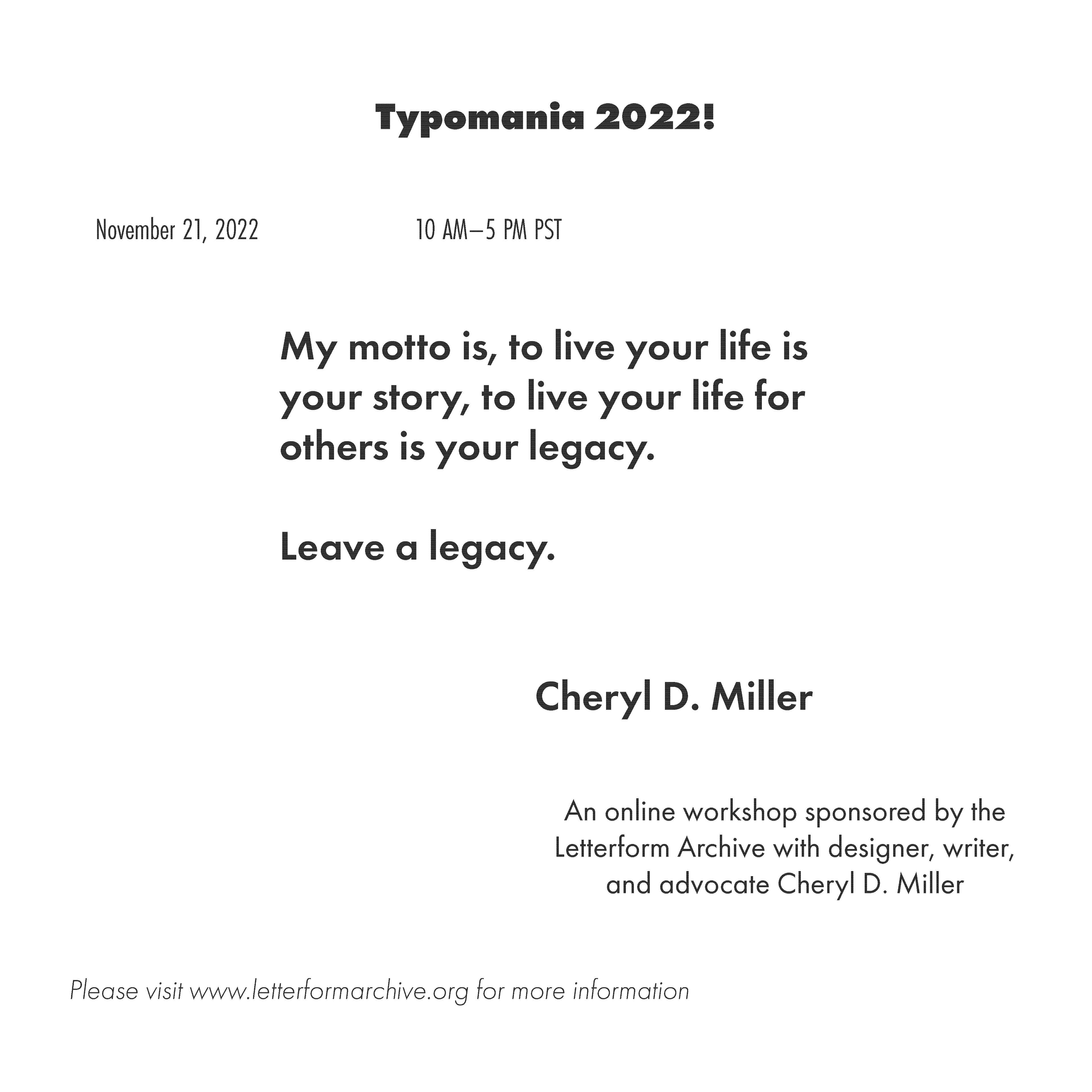
A lot of my ideation was focused primarily on how to fit each element into the given space, while still effectively filling space and allowing the hierarchy to create a dynamic piece. I wanted to engage the viewer and lead their eyes around the page with the given information. When I first began I worked only in black and white. I wanted to avoid using color as a crutch.
Color Drafts
After several rounds of ideation, I took a few favored layouts and played around with different typefaces and colors. I chose Futura because it was a sans serif with multiple variables. The sans serif allowed for easy scaling and improved legibility, while the typeface variables made it easier to create a well-defined hierarchy.
Final Designs
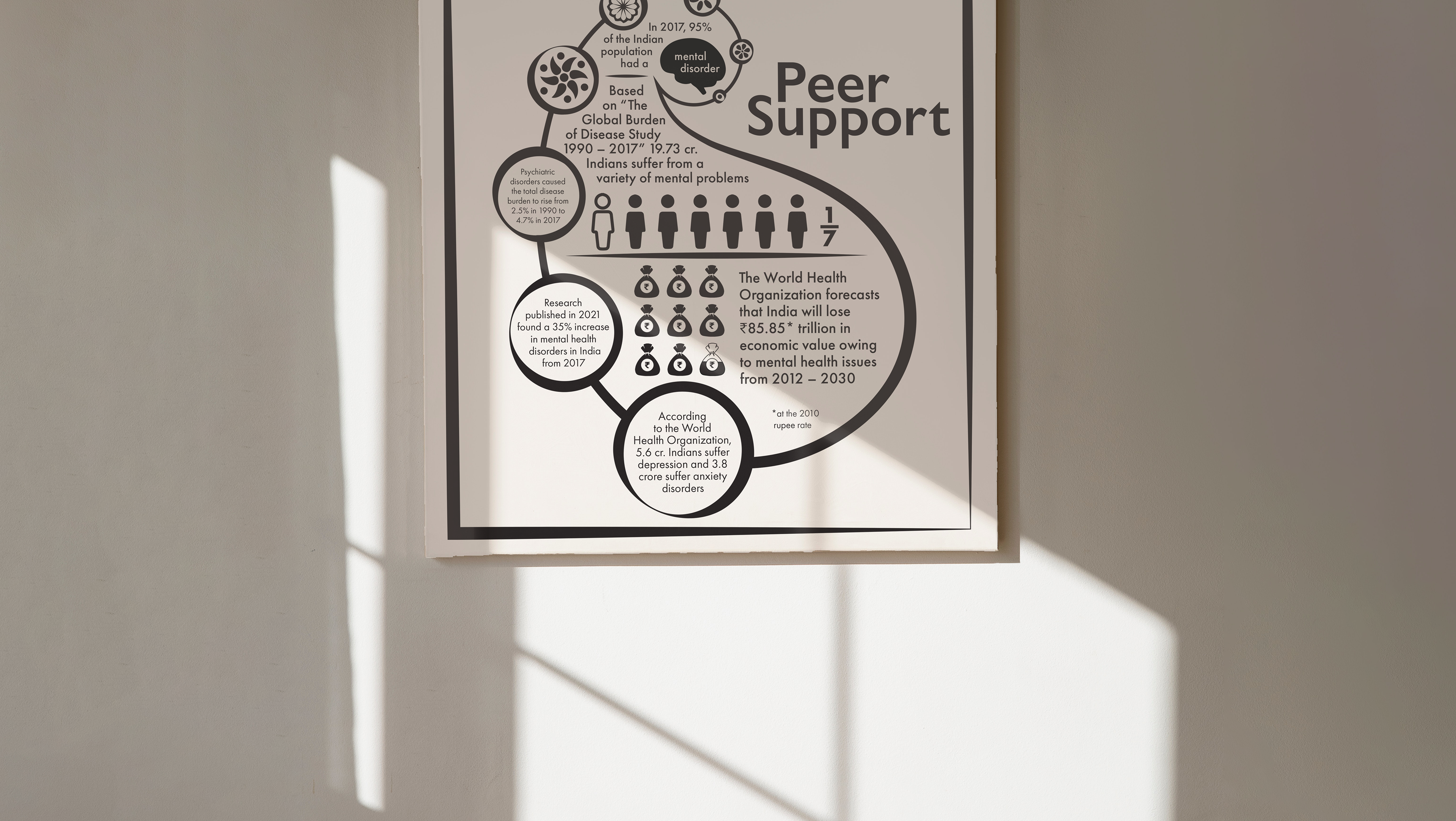
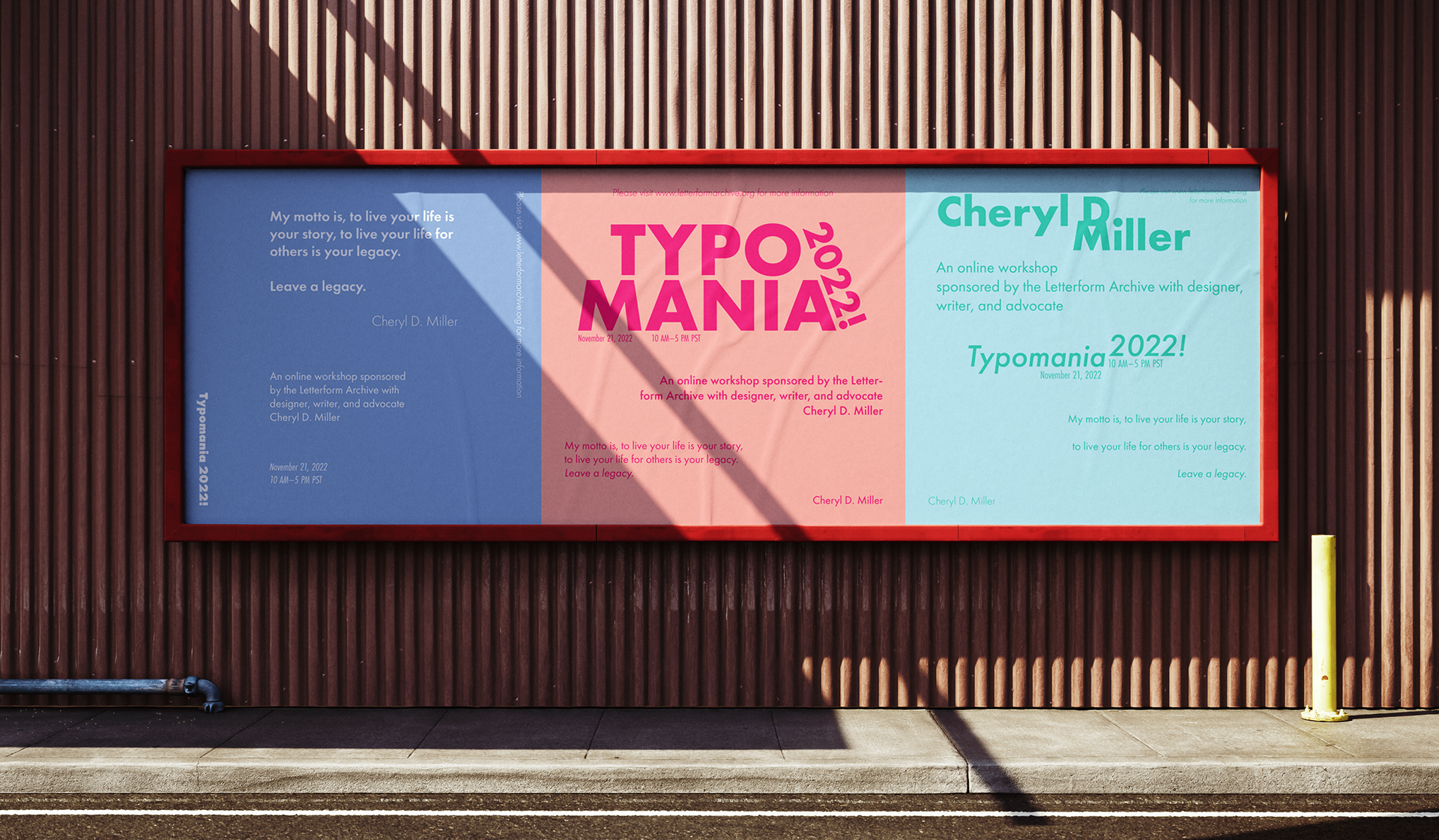
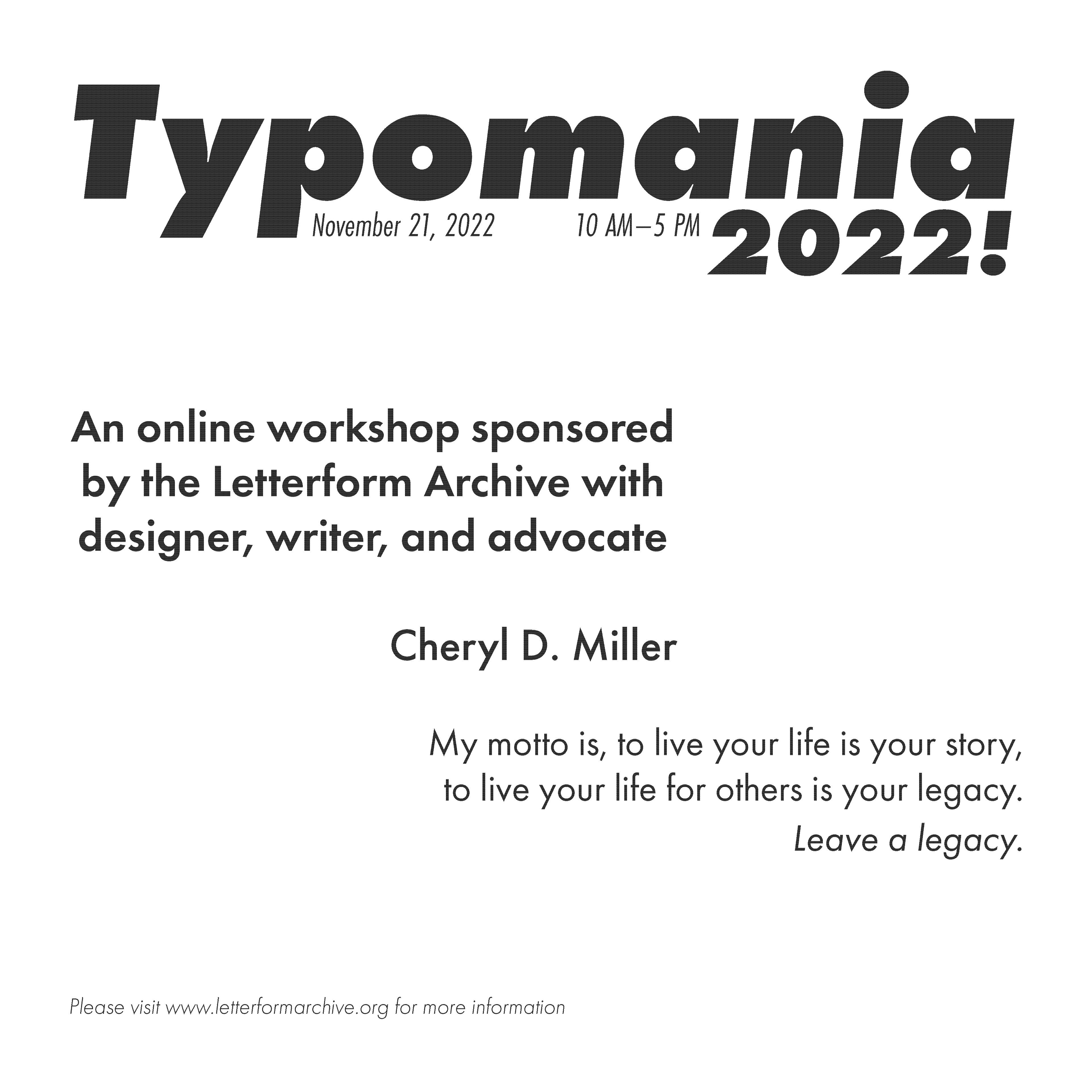
After a few critiques, I made some minor sizing and spacing adjustments. I also abandoned the use of lines to let my type speak for itself. I used mockups to demonstrate how my final designs could be implemented in an advertising campaign.