The Brief
This will be a comprehensive re-branding where you will create a brand book that showcases strategy, branding, visual identity, and implementations for a client. You will choose an existing non-profit organization or a public sector organization to design for. You will be overhauling the client's existing brand identity and creating an entirely new one which you will be expected to present to the client.
The Goal
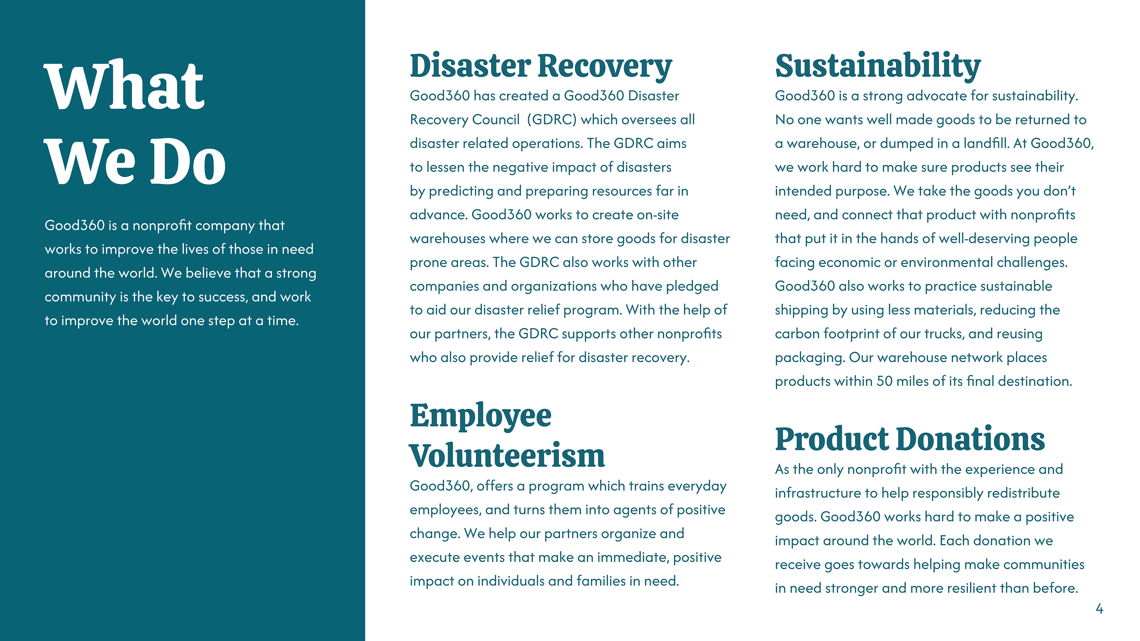
In order to establish a clear goal, I first had to know what I was working with. I did a quick search of nonprofits using Guidestar and decided on Good360. I resonated with Good360's stance of preventing waste, providing help, and remaining eco-friendly. After combing through Good360's assets I had a good idea of where to start. Good360 needed more touchpoints and a better visual direction. They needed to let go of gradients and the low-contrast, low-impact colors they were using. They also needed a stronger established voice.
Research
After a quick comb through of Good360's assets. I took a deep dive into the contents of their webpage, and the little information they provided on social media. After gathering more in-depth information about who they were and what they did, I began to make adjustments. I agreed with what they wanted to accomplish but felt they needed to market more aggressively than they currently were. I left their core actions and services intact but built upon their policies and benefits to provide better support for the average donor.
Logo
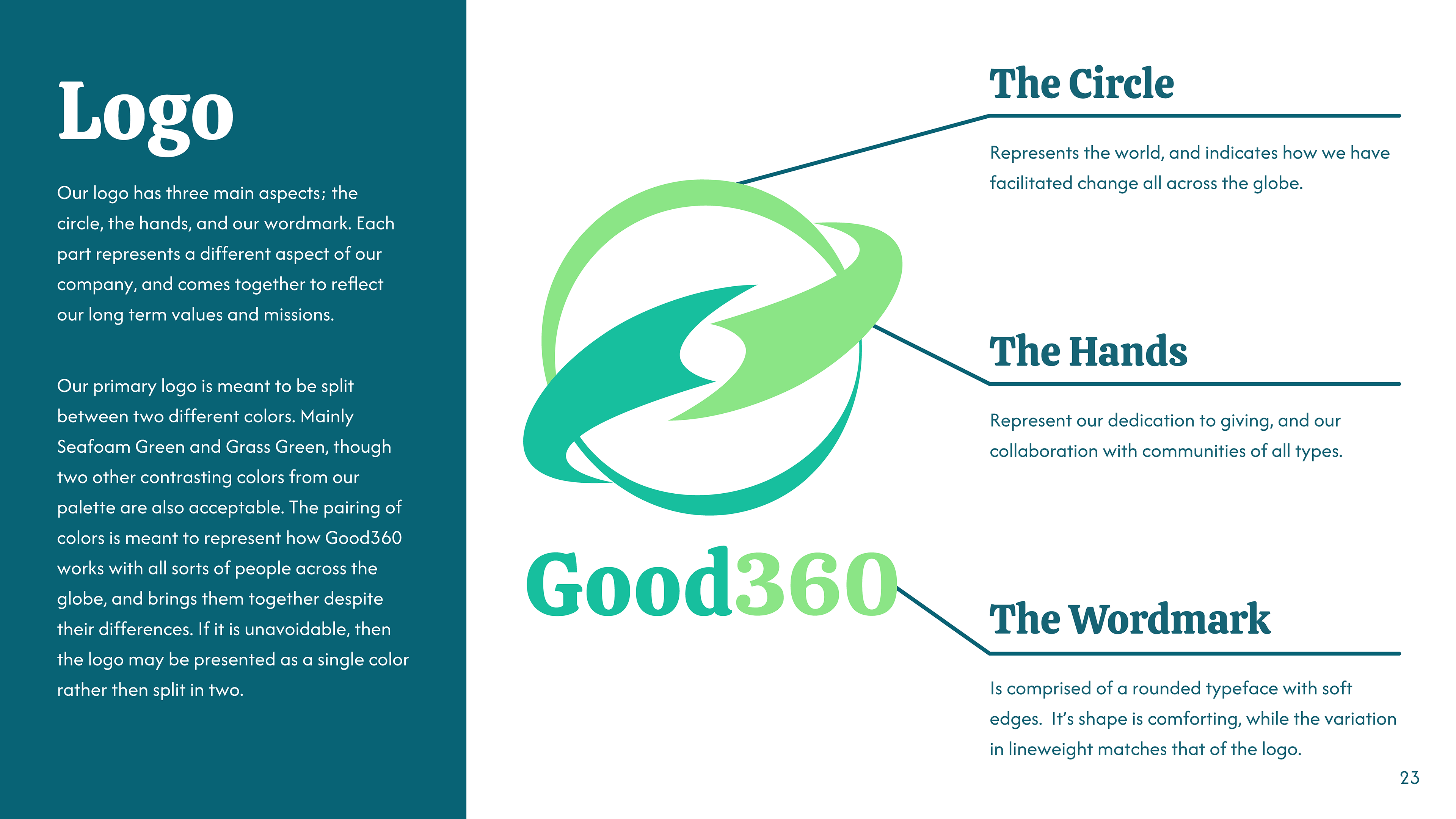
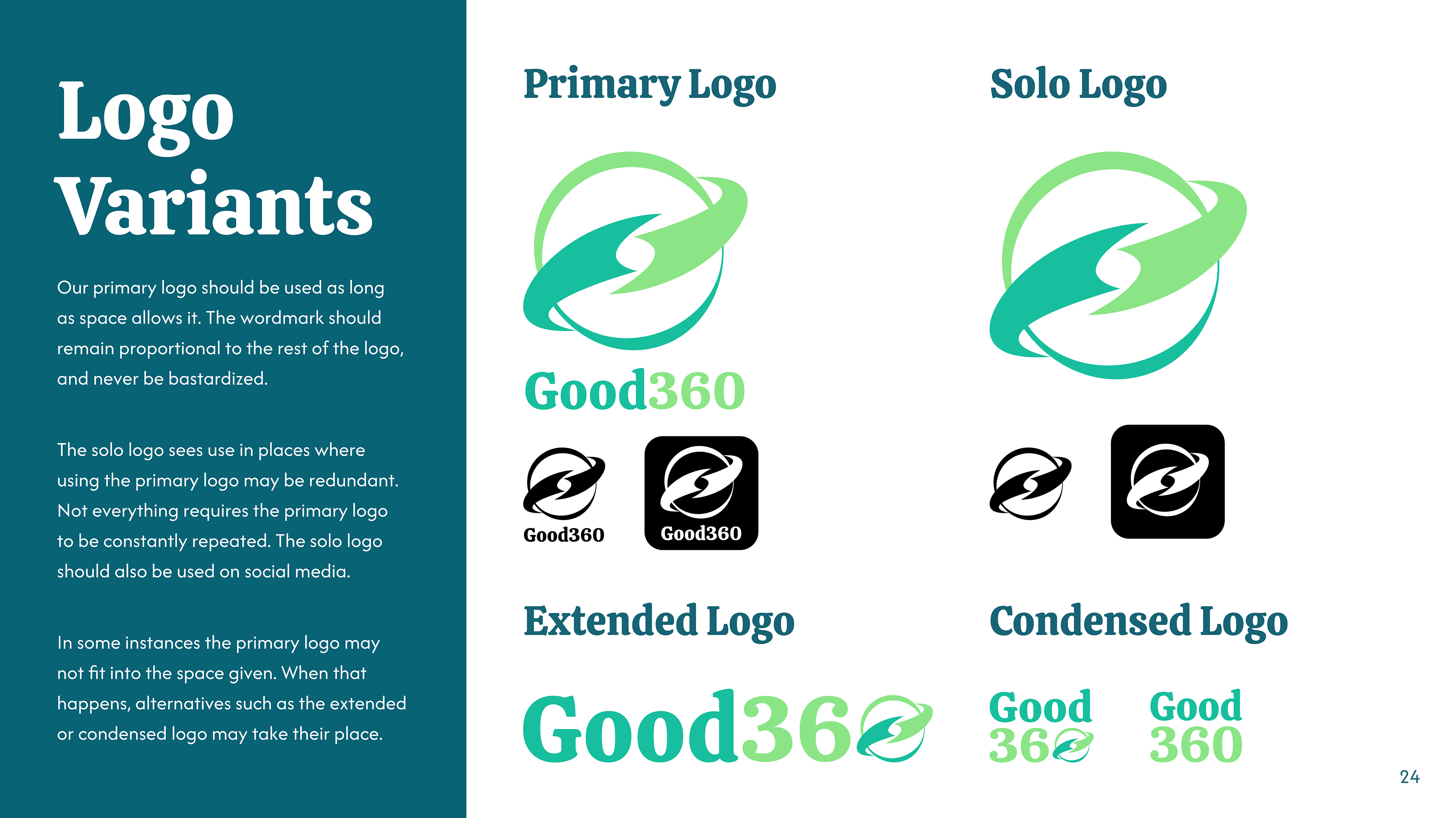
After completing my research I had a better understanding of what Good360 stood for, and where it should go next. I wanted to overhaul their previous logo as it was ineffective. The original logo was grey on green, it had no contrast and barely stood out against lighter backgrounds. The main logomark was a stylized "G" that looked more like the power symbol on computers than anything else. I wanted a logomark that would stand out, have good contrast, and truly encompass Good360.
Branding
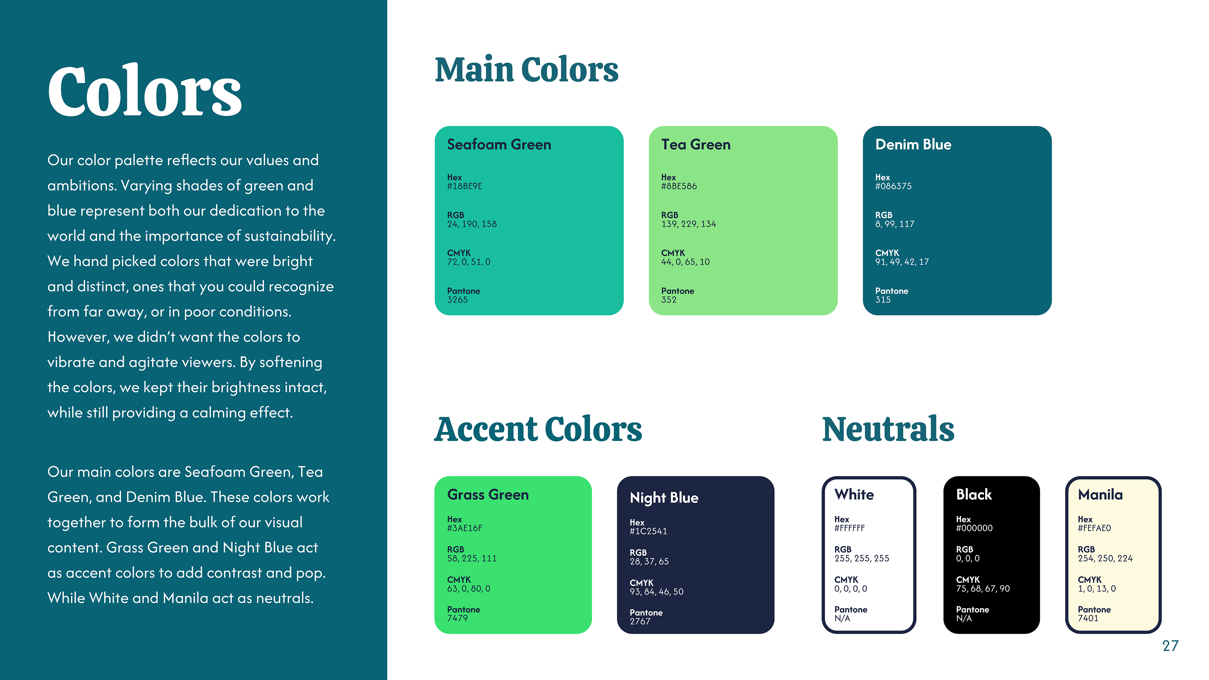
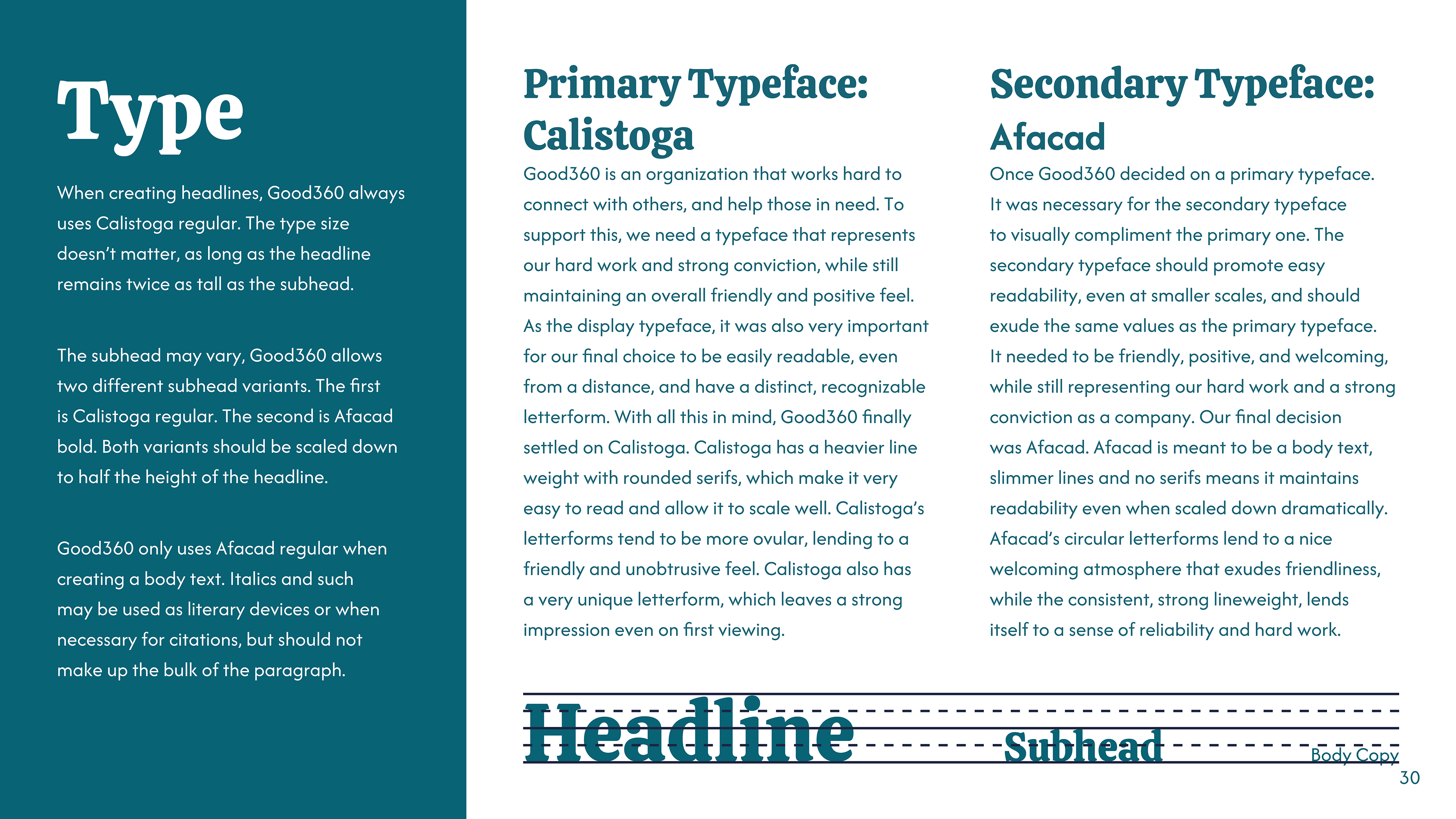
It was important for the colors to mirror the brand. Good360 strongly advocates for environmental sustainability, and they operate globally to help those who suffer from natural disasters. To reflect this, I chose varying shades of green and blue. I avoided choosing colors that were oversaturated, I wanted the brand to have a calming, soothing feel.
Marketing
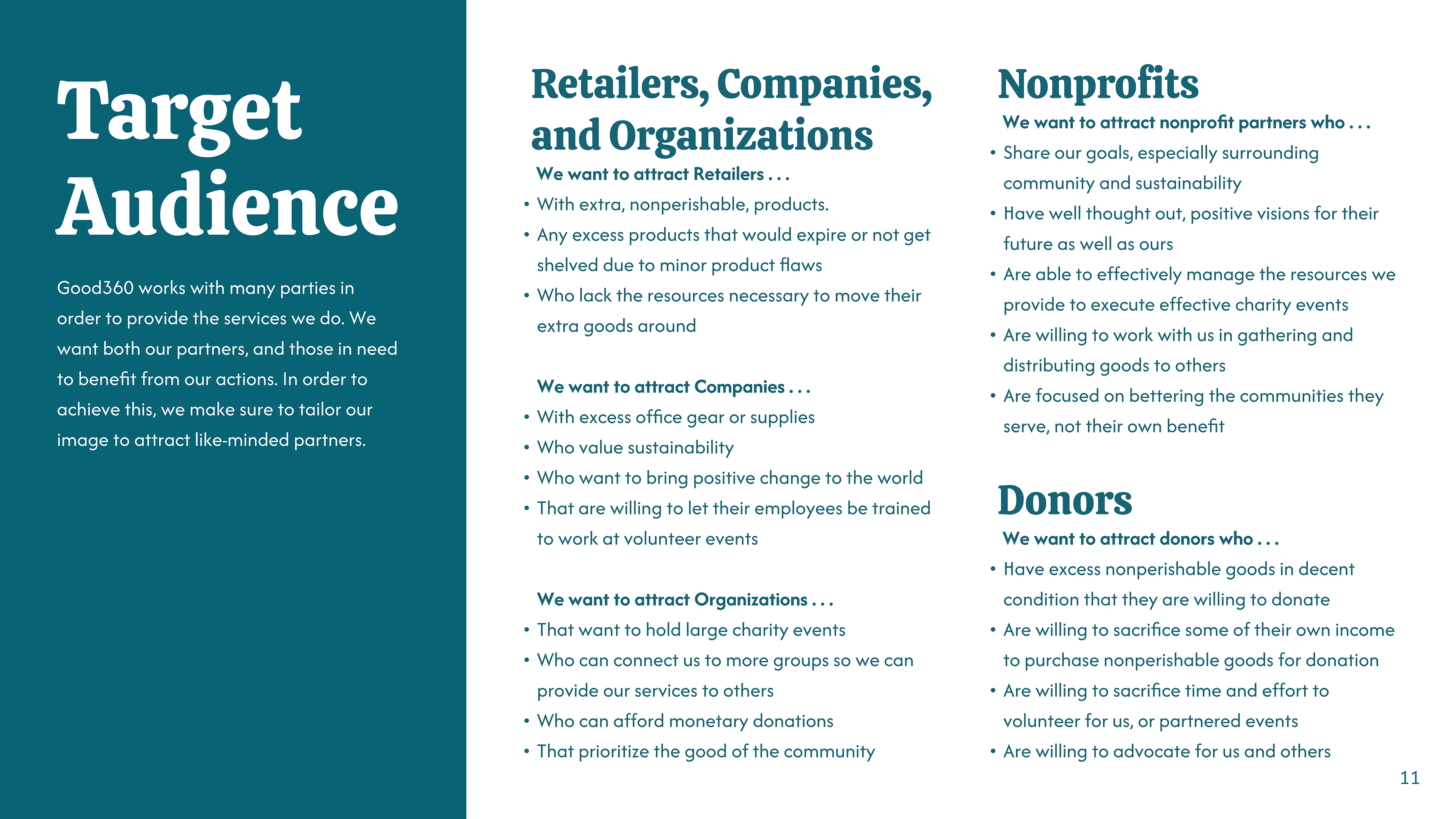
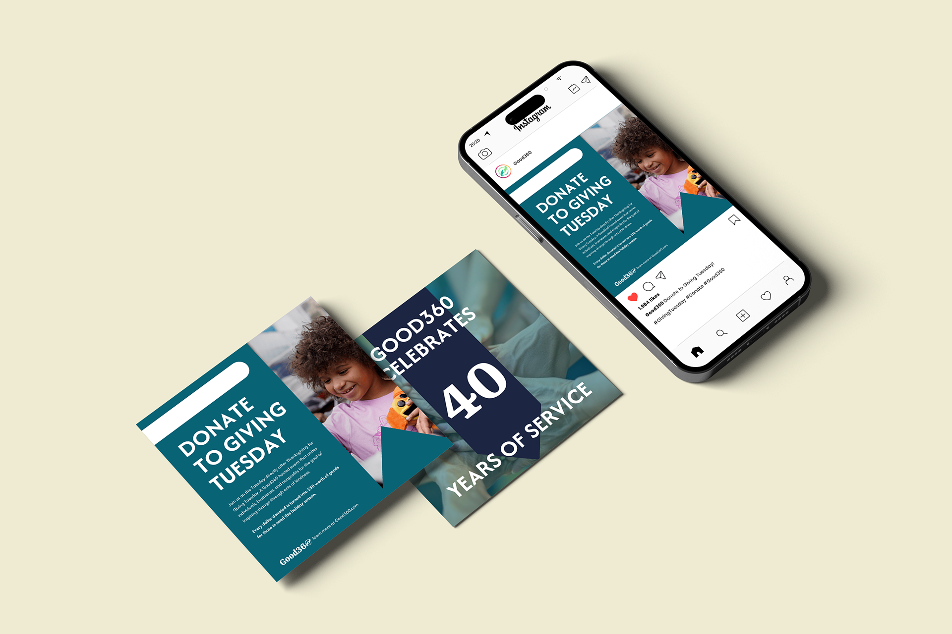
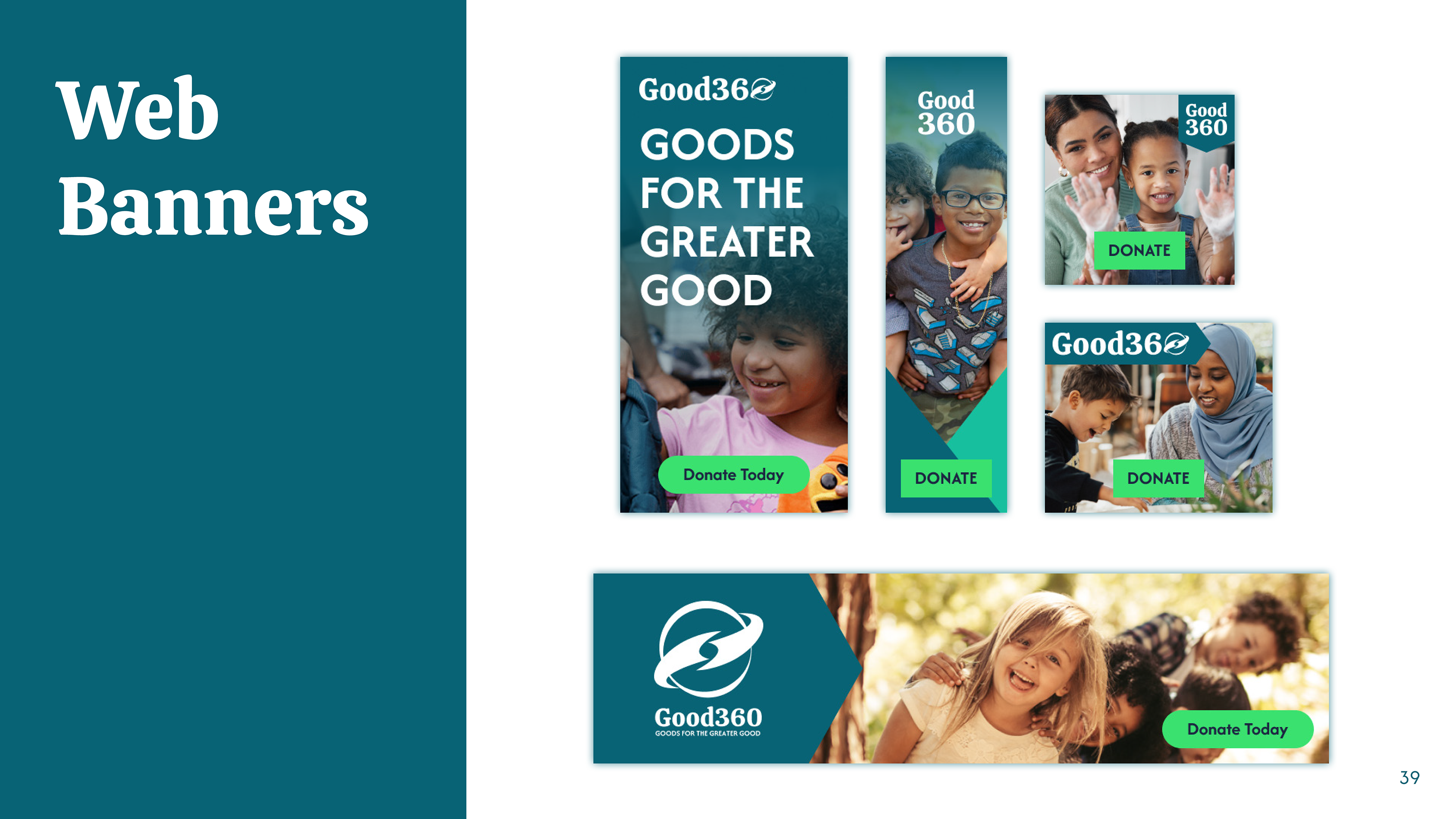
Good360 is a brand that relies heavily on donations to make a difference. The company needs to reach as many people as possible and build a positive reputation. Due to this, it's important to have a strong digital presence. With this in mind, I focused heavily on digital aspects such as social media, web banners, and a revamp of the website. In an effort to appeal to our corporate partners, I also designed a business card to improve networking.
Web Design
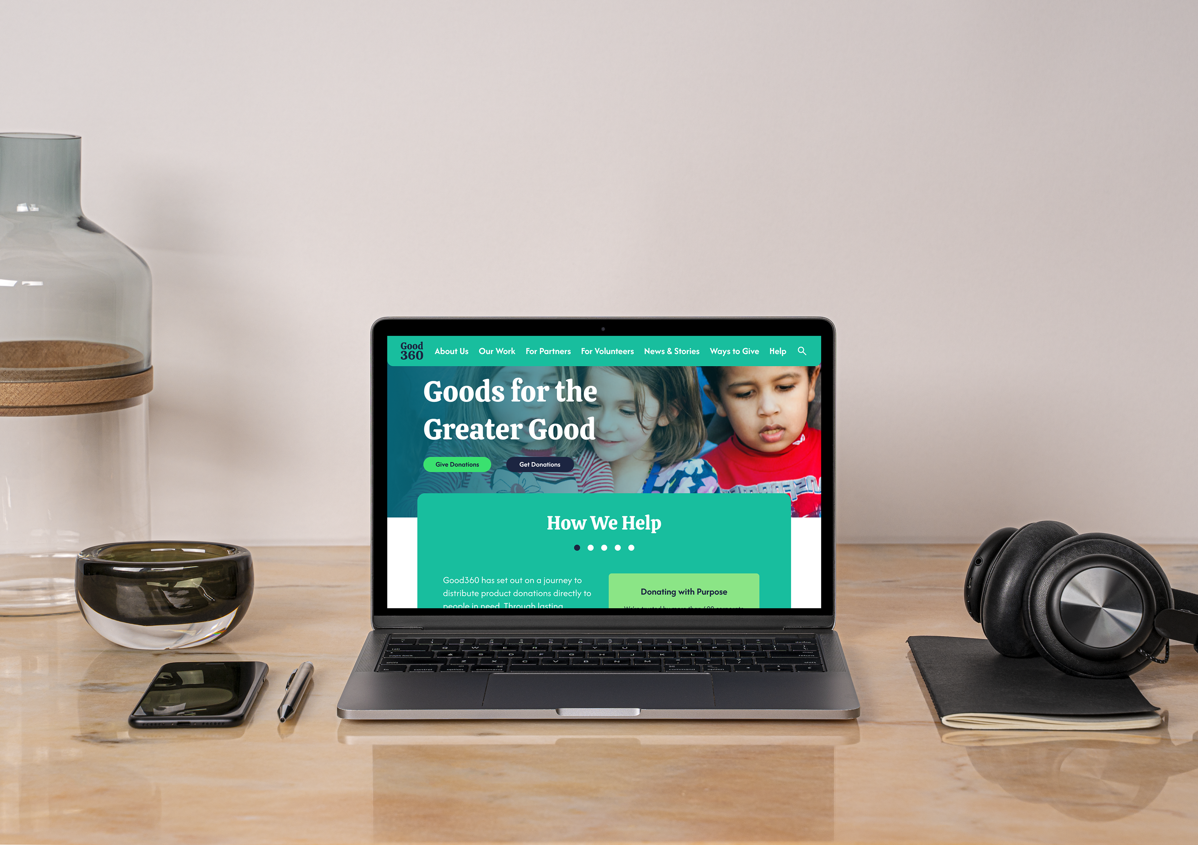
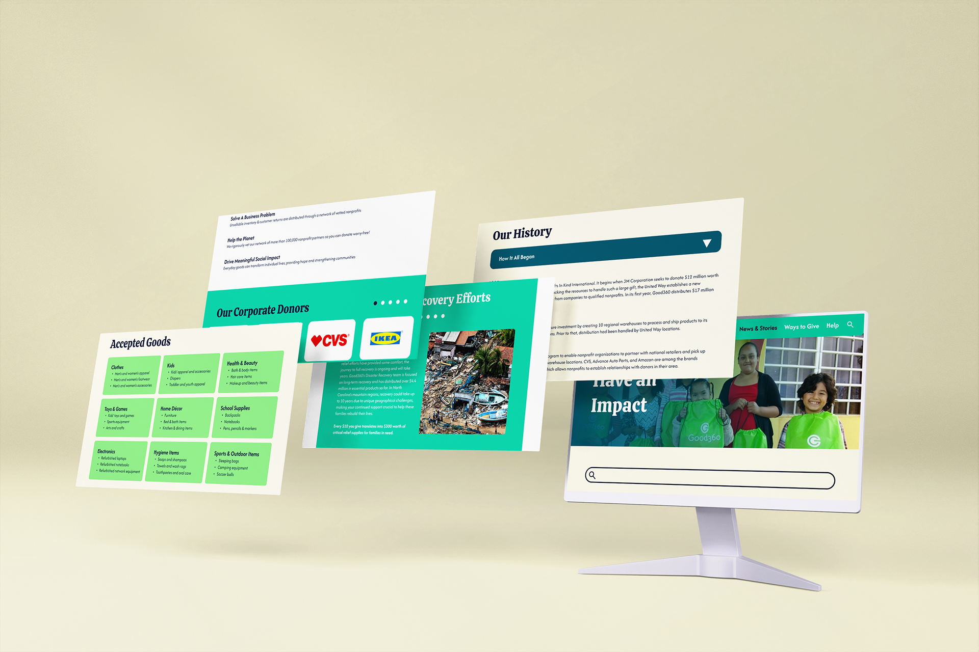
With the main touchpoint of Good360 being their website, I knew I would have to redesign it entirely. It needed to be as straightforward as possible, with ample spacing and more visuals. It was important to place a call to action on almost every page to push people to donate, volunteer, or make an impact in another way.
